Everyone is on a journey these days. The use of the word “journey” has journeyed into the realm of overuse. You may be a reality tv contestant on a journey to your 15 minutes of fame or, like me, describe the fluctuations in your waist size as a “fitness journey”. The term “customer journey” may too be on the precipice of overuse in marketing circles but, ultimately, applying best practice to your website’s customer journey may send you on the way to being much more successful online.
So what is a customer journey and why is it important to web design?
Every consumer is different and there are many varying motivations and routes they can take when purchasing your product. To put it simply, a customer journey details the stages a consumer makes on the path to purchasing your product (or donating to your charity or reading more of your articles).
Customer A might first hear about your product from a Facebook Ad while drunk. They click-through, purchase and 3 days later a parcel arrives that they have no recollection of buying.
Customer B may have first heard about your product through a Facebook Ad too. She then proceeds to read a dozen reviews, half a dozen case studies, watch 4 YouTube tutorials and ask a series of questions to your customer service team. She then buys a week later.
These customer journeys are not the same but the outcomes are.
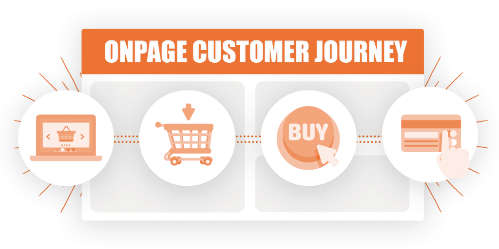
In fact, no two customer journeys are the same: so how do we map a typical customer journey and make it as frictionless as possible?
Here are three brief case studies from prominent brands: one for e-commerce, one for booking and one for content.
Case study 1: Buy the Casper Mattress
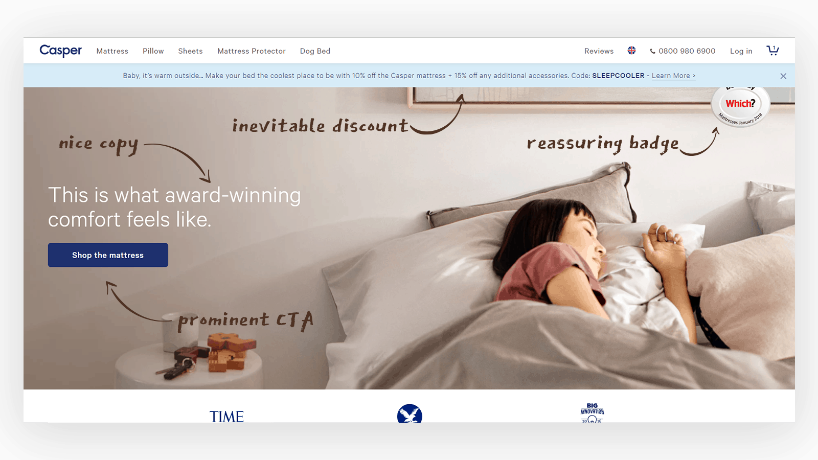
Casper are the subject of many, many marketing case studies. When you spend $300m on marketing it doesn’t just help you, it informs the industry too. Above is an annotated gallery of the standard successful user journey on the Casper site: I’ve visited your site and I want to buy a mattress.
As we can see from the home page, Casper are prominently advertising their mattress with a full-screen splash, some reassuring copy and a Which? endorsement. The call to action? “Shop the Mattress”. Not “Shop for Mattresses”. The mattress. The one. The one you’ve heard about in all the podcasts. Casper do have other products and the main navigation will take you there if you were more interested in getting your dog a mattress. The only distraction on this page is a notification bar informing me that I can get a discount. This is pretty much essential for a brand like Casper whose myriad of marketing channels are often driven by discounts. If I want to buy a Casper mattress, I know a discount exists. By offering me a discount immediately Casper are keeping me on their website.
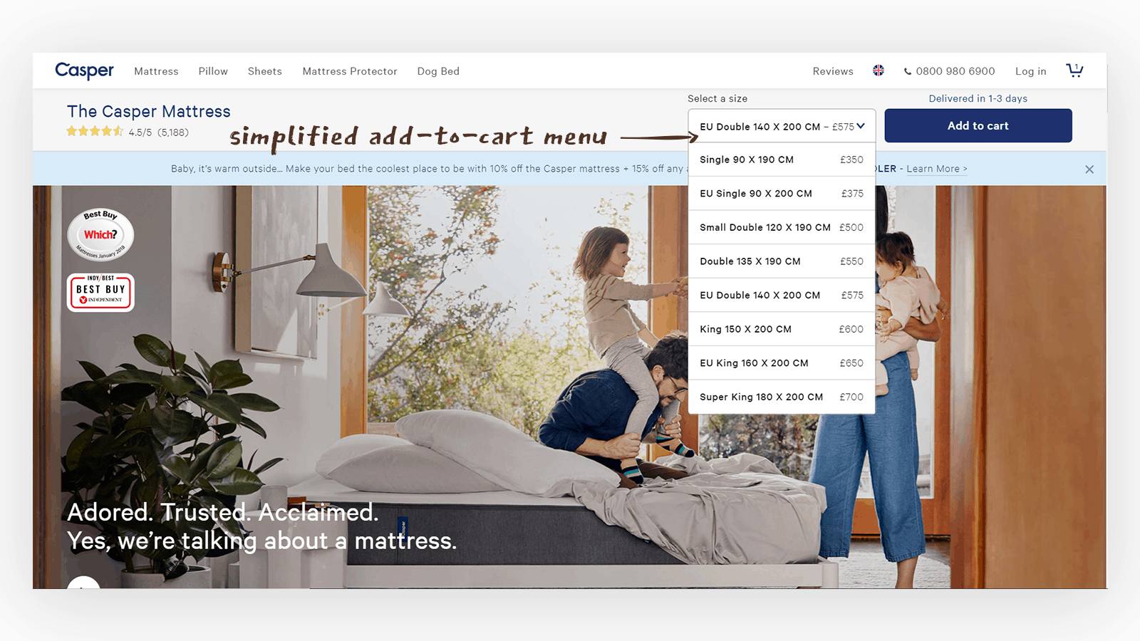
Product Page – On the product page I can get insight into how the mattress has been made, tested and reviewed. I can also be further reassured by the 100-day guarantee. Unlike other sites where the various different mattress sizes might have been treated like different products, I’m being driven to select my mattress size from a drop-down and add it to my cart. I haven’t been asked how many mattresses I want as most people buy one. I can buy more than one but Casper haven’t overcomplicated this flow.
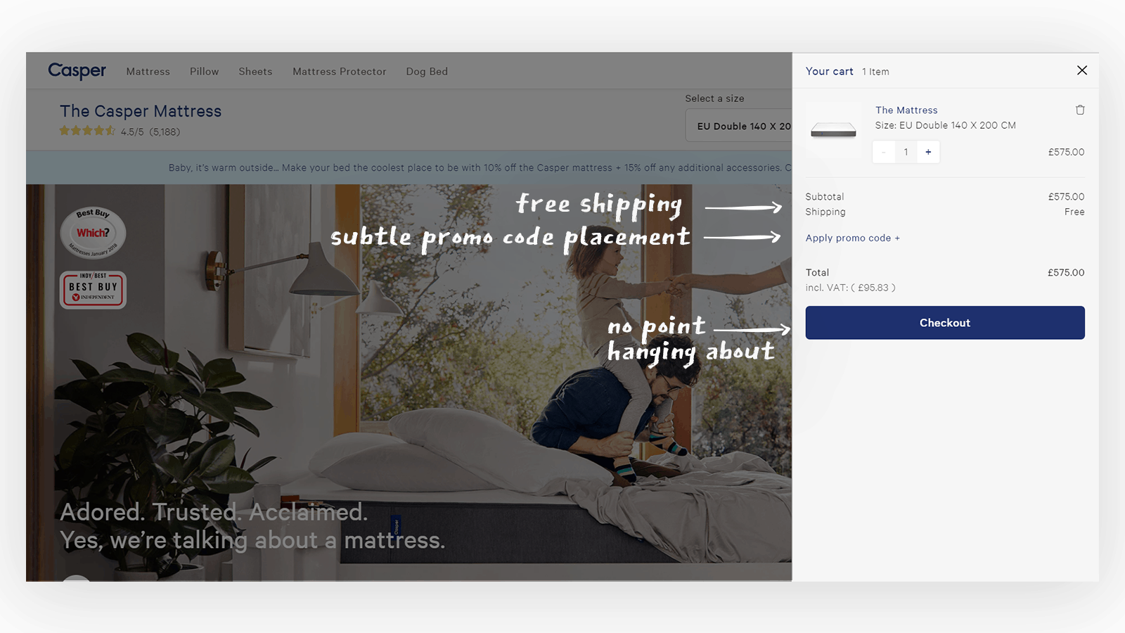
The cart: Again, most people buying from Casper’s website buy 1 mattress. The cart automatically opens, I’m given the subtle option of applying a promo code and I’m being prompted to go to the checkout.
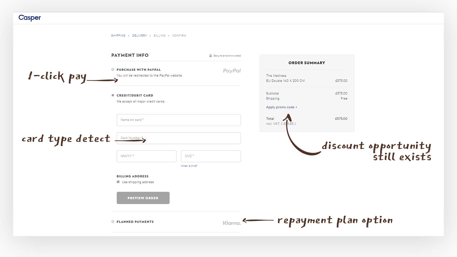
The Billing Stage: Once I’m in the checkout phase, the conventional site navigation disappears. It’s time to focus. I am presented with several options: do I want to pay with 1-click via PayPal? Do I want to pay with my credit/debit card (and the card type is automatically detected)? Do I require a repayment plan? Still, at this stage, I can put in a promo code.
Case study 2: Get your eyes seen at Specsavers
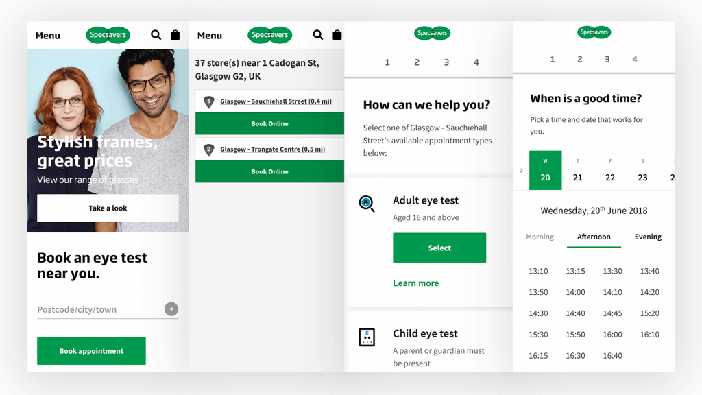
If you’re not selling directly on your website, then chances are you’re taking appointments. Specsavers, of course, does both but we were particularly impressed by their customer journey for booking an eye test.
Booking an eye test is prominent on the website and reflects one of the two main tasks carried out by visitors to the website: book an appointment or buy glasses.
The user can then search by location, by either typing the location or by letting Specsavers know your browser’s location, and are given a list of their closest shops.
A simple card view of possible appointment types, sorted by popularity, is presented to the user who then picks their time from a list of available appointments.
The user can only pick from appointments that are available. The user is not able to enter a time and check for appointments close to that time. The appointment availability check was done in advance of the user selecting anything. By only offering what is available, potential friction is reduced. This is similar to when e-commerce sites deprioritize and visually indicate items that are out of stock – giving the visitor less opportunity to get upset.
The user must then provide their contact details and confirm the appointment. While the number of details that Specsavers requires leans on the excessive side, there is good reason for this.
- Specsavers can check the user’s eligibility for a free eye test.
- By taking the user’s contact details the user is less likely to abandon the appointment if the threat of an angry phone call looms.
At this point, Specsavers are creating the sort of friction which benefits their business.
Once the appointment is confirmed the user is then prompted to add the event to their calendar. If reminded of an event by their phone, the user is more likely to attend. This also saves the user any time required to manually update an appointment.
This is a particularly good customer journey because at no point was any distracting information presented to the user.
Case study 3: Read More on The Outline
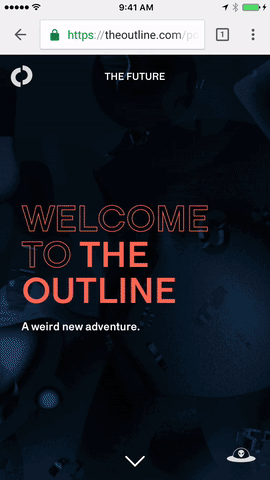
The Outline is a design-driven culture publication started in late-2016. Unlike the majority of content websites, the Outline focuses less on a New York Times or Guardian style grid-driven homepage and more on mobile first, immersive and highly swipeable content.
The Outline is a website who expects its users to interact with it as if it was Snapchat. While swiping on the web is still uncommon the user is prompted that they can swipe on first visit, while dot navigation indicates swipability to returning visitors.
In the .gif above we see how easy it is to swipe between articles on the Outline. Is the current article not interesting to you? Try another! This ties heavily into the notion, originating with the ethical designer Tristan Harris, that your smartphone is “the slot machine in your pocket”. Unlike the randomness of social media, The Outline is a publication with an ethos and a perspective: if you share that ethos swipe here and there’s a good chance you’ll find something you like.
Every few swipes on the Outline brings the user to an advert. Not just any old advert though: an advert that is native to the website and is formatted like an article. While the advertising is clearly marked as such, the aesthetic of the ad page is more likely to compel people who like the design choices of The Outline to pay attention to it.
So, if you want users to read more or to read more adverts then the solution is simple: immerse them in the content, make finding new content super easy and make your adverts just as attractive as your feature stories. Perhaps this is not that simple after all.
Some best practices
Fast Page-Loading Times
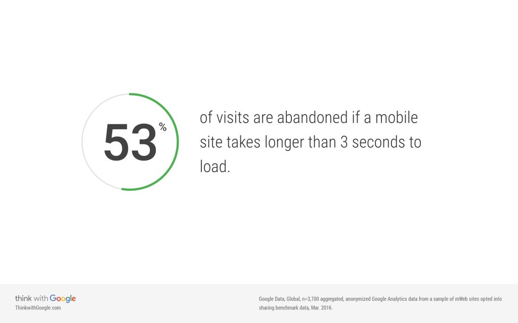
This one is easy to overlook. The design of your website is paramount and everyone has a good connection these days anyway? Well, not according to Google. As many as 53% of users will leave a website if it doesn’t load in 3 seconds on mobile! We live in the age of the app, where content is often delivered when the customer isn’t paying attention so it seems instantaneous when they are paying attention. This means that the good old web suffers from the shortened attention span of the average mobile user. By delivering your website even more quickly to your user (and by saving them on their data bills too) you can guarantee a better chance of turning your website visitors into paying customers.
Think of this from the user’s perspective. I want to buy your product now and my phone signal is iffy at best. Can I do it? Will you let me?
Clear Calls-to-Action
Button design has been on a journey but the old wisdom still remains true: the more obvious a button is, the more likely it is to be clicked!
I’m a big believer that the first call-to-action on your website should reflect the ultimate goal of the user journey. Got a service? Sign Up. An App? Download App. Generating leads? Get in Touch.
When there is additional complexity, for example in e-commerce, then emphasis on seasonal goods or sale items may take priority on the homepage. If someone wants something from a category or a particular item type then chances are that at some point they’ve used search. For most websites, that will involve Google Search. For Amazon and Ebay, search often occurs natively on the platform.
Top Tip: Clear URL structures and categorization are super helpful to users not just on-page but when they are finding your website through search engines too.
Checkout Design
I want to buy your product but I have 5 minutes until I have to leave the house. Your website design and pagespeed will absolutely have an influence on whether I can do this but your checkout design creates potentially the biggest piece of friction in the process.
The team at Spiralyze have written a fantastic (28-part) series on checkout best practices that I recommend you read but I will highlight a few important points here.
Reduce Distractions
Once someone is at the checkout stage, allow them to focus on the process. Keeping your site’s standard navigation in place might just cause someone to stop paying for your product and have them read a blog instead. Having a coupon code section that is very visible will cause your customer to leave your page and research if they can find a coupon code elsewhere!
No Unnecessary Form Fields
Is your client a Mr.? A Mrs? A Sir? A Dr? A Viscountess? A Captain? Does any of this matter? While inclusive design is a big trend – the overarching theme of not asking unnecessary questions is important for optimising the customer journey. Every time you ask a question you are creating a point of friction that might just stop the buying process.
Constantly reassure the customer
Money back guarantees. Easy returns. Emphasise the security of the till. These are all ways to reassure the customer just as they’re about to hit the “confirm purchase” button. Understand that regardless of testimonials or reviews, someone who is a brand new customer to your website will feel some degree of anxiety about confirming a purchase. Do your best to mitigate this.
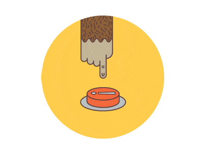
On the other hand, Mailchimp (the email marketing service) has a phenomenal way of creating anxiety around a conversion point. By animating a sweaty, shaky finger over a big red button Mailchimp emphasises that there is no way to stop their mailer after this point and you better be sure that what you’re sending is correct.
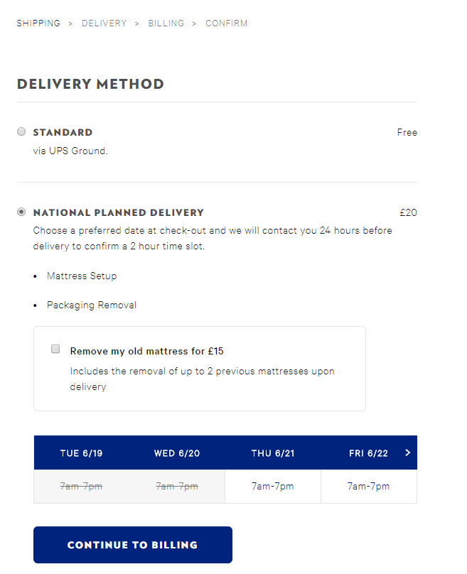
Transparent Delivery Prices & Process
Deliveries are an enormous source of anxiety for users. Be explicit when listing your delivery options. Being stung late in the checkout process by a heavy delivery fee or an ambiguous shipping window can put customers off for good. Driver tracking, like on Amazon Prime Now or via DPD, helps reassure customers that they know exactly where their product is. Conversely, online junk bazaar Wish.com famously ships its low cost and dubious quality items in 24-30 days, deliberately de-emphasising the importance of the product (if you need something urgently, you won’t get it from Wish).
Conclusions
The principles of creating a good user journey are, at their heart, simple:
- Get your user from the beginning to the end of their journey in as few steps as possible.
- Utilise both the design and technical aspects of your website to minimise the friction for the user.
- Test, iterate and welcome feedback.
- Use industry best practices not only to inform your design but to create familiarity.